Experience Designer Mel Sloan and Graphic Designer Rebekah Schleppy collaborated on a visual that delightfully sums up how we work at Strada, and have been for 25 years. As the year comes to a close, take a deep dive with us into the story of how our “25 Years of DESIGN with People in Mind®” logo came into fruition.
This was an important anniversary year for Strada. How did the team get started?
Mel Sloan: We started with what you’ve just said; a headline: “Strada is celebrating 25 years!” It was simple and to the point, and yet…it was the headline that ultimately forced us to pause and ask ourselves a single, critical question: “25 years of what?”
We knew wouldn’t be able to design anything, including any kind of illustration or wordmark, until we could answer that question. So, we had a “what are we celebrating” workshop. We looked at our list of engagement ideas with fresh eyes and had an in-depth discussion around what we were most excited to share.

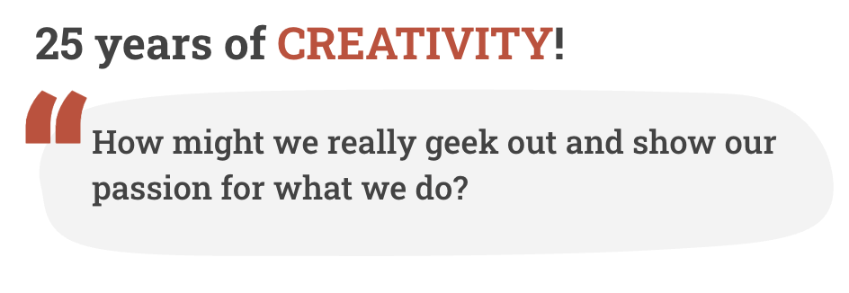
Our most meaningful stories fell into three topics: Connection, Creativity, and Growth. We plugged them into our headline and built a framework that gave shape to our entire campaign.
Rebekah Schleppy: It initially started when I was asked to create a “25 years” addition to our logo. I created about 8 concepts and shared them with the team. One rose to the top, and ignited further discussion of “25 years of what?” In true Strada fashion, this pushed things to new heights, allowing us to develop ways to stand out and share more of a story.
Then you were ready to design?
MS: We were ready to design! With our framework in place, we collapsed the headline into something so natural and obvious, it was almost comical: ’25 Years of DESIGN with People in Mind®.’ I know, it doesn’t look like rocket science. It doesn’t have to!
Our process had given us incredible clarity around what that statement meant for our campaign and for our anniversary. We knew what we were celebrating and we would use DESIGN to tell our story. It was time to start sketching!
RS: I think it was perfect that we ended up with “25 Years of DESIGN with People in Mind®”. Design messages don’t always have to be complex, especially since this brand has been 25 years in development!

MS: Our framework would shape our campaign, but our mark would need to capture both our culture and our craft. We started by studying examples of illustrative typography that resonated with our concept. Architecture merging with letterforms, vignettes of streetscapes, and organic curves shaped from curling leaves and twisting branches. We explored ways to share our passions through a cohesive story.”
RS: This was in manifestation for about a year that coalesced naturally. I started with hand sketches and shared them with the team, heavily focusing on our cross-disciplinary aspect as letterforms.
And the rest is history! Can you walk us through the final product?
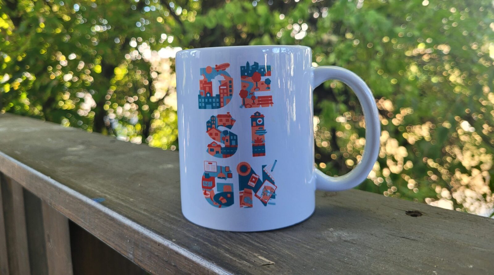
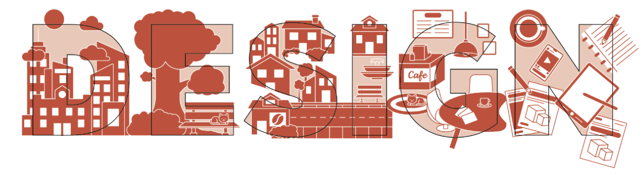
MS: The final design captures the types of projects we do and the disciplines we work through. It also includes some of the things we love: plants and fountains, sidewalks and streets, coffee shops and cats. We’re traveling through an imaginary city of our own making. Starting with a skyline and passing through a park, we settle happily in a café to get a little work done.
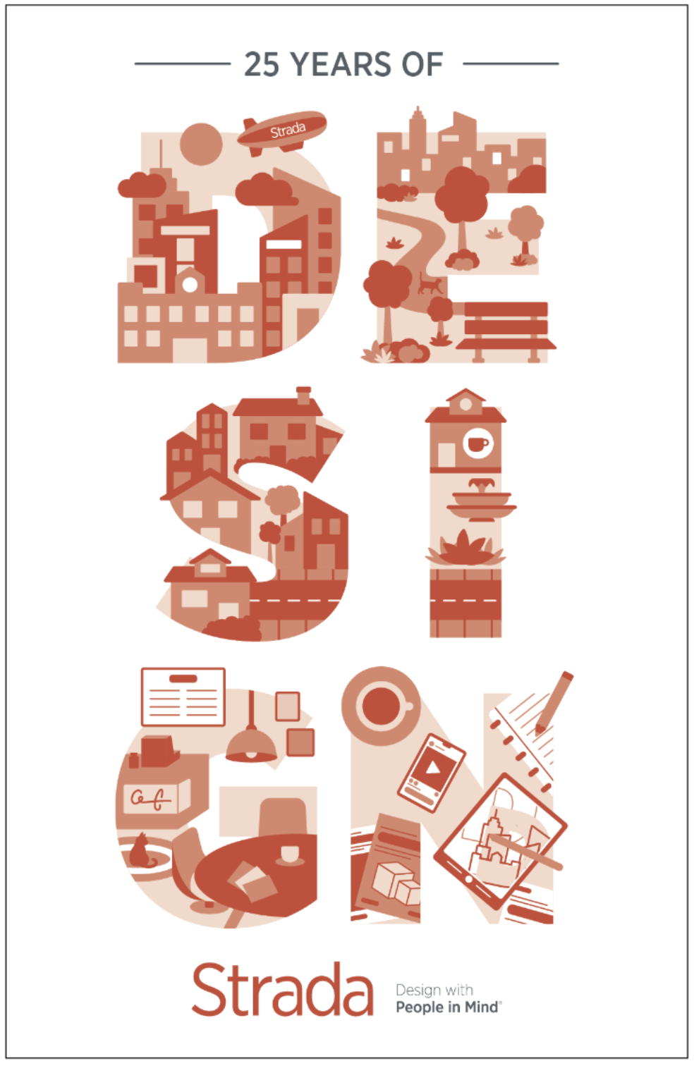
RS: It was an intentional full-circle moment. The letter D introduces the first discipline, architecture, along with a quintessential Strada Easter egg, the Strada blimp.
E represents landscape architecture, with the cityscape in the background. S and I together feature scenes of urban design, including a little café at the top of the I. If you know Stradistas, you know that coffee is a necessity!
Letter G, we are now inside of the café, showcasing interior design. Lastly, N is a closeup of the table we approached in G, and represents graphic design. If you look within the iPad, you will see the design process of the D and its cityscape being developed, closing the circle.
When all was said and done, how have you utilized the DESIGN logo?
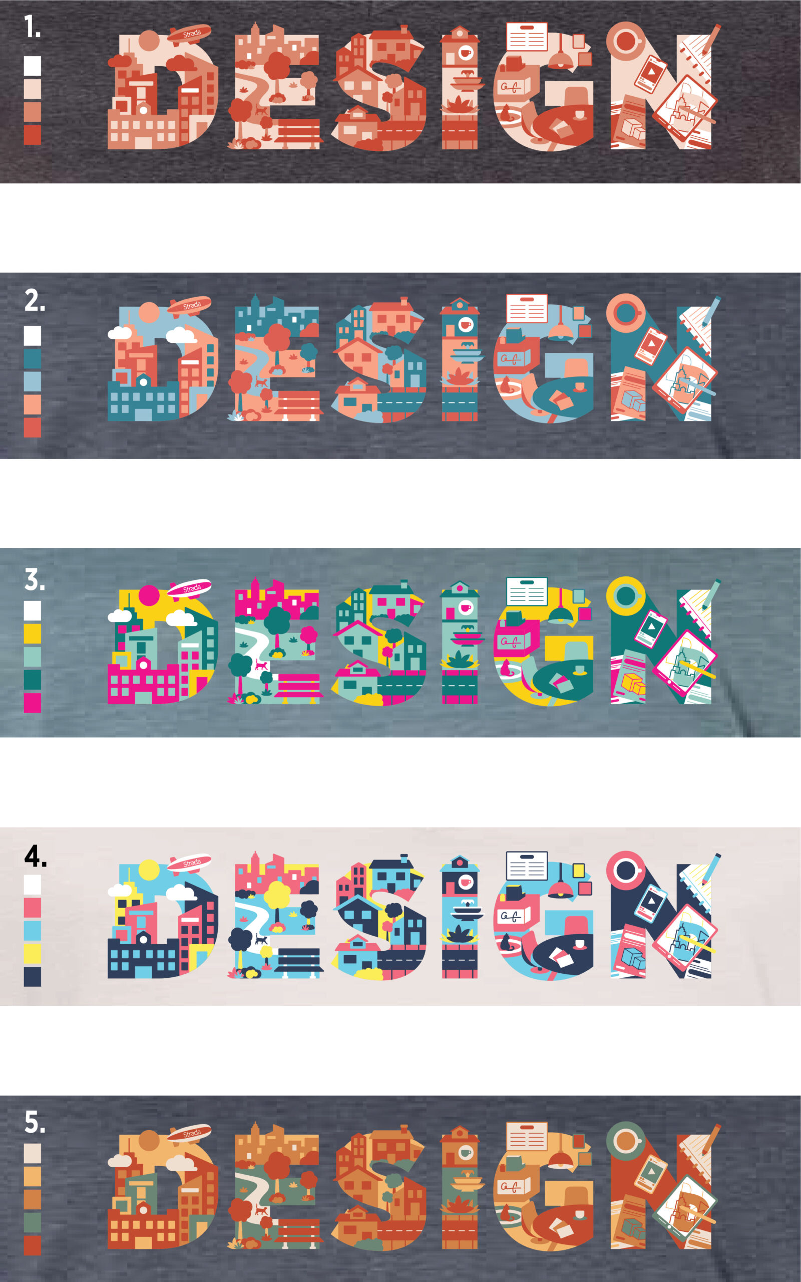
MS: With a DESIGN we loved, we dove into color studies. We knew Strada-red would be our go-to for marketing, but we couldn’t resist seeing our little city in full color.
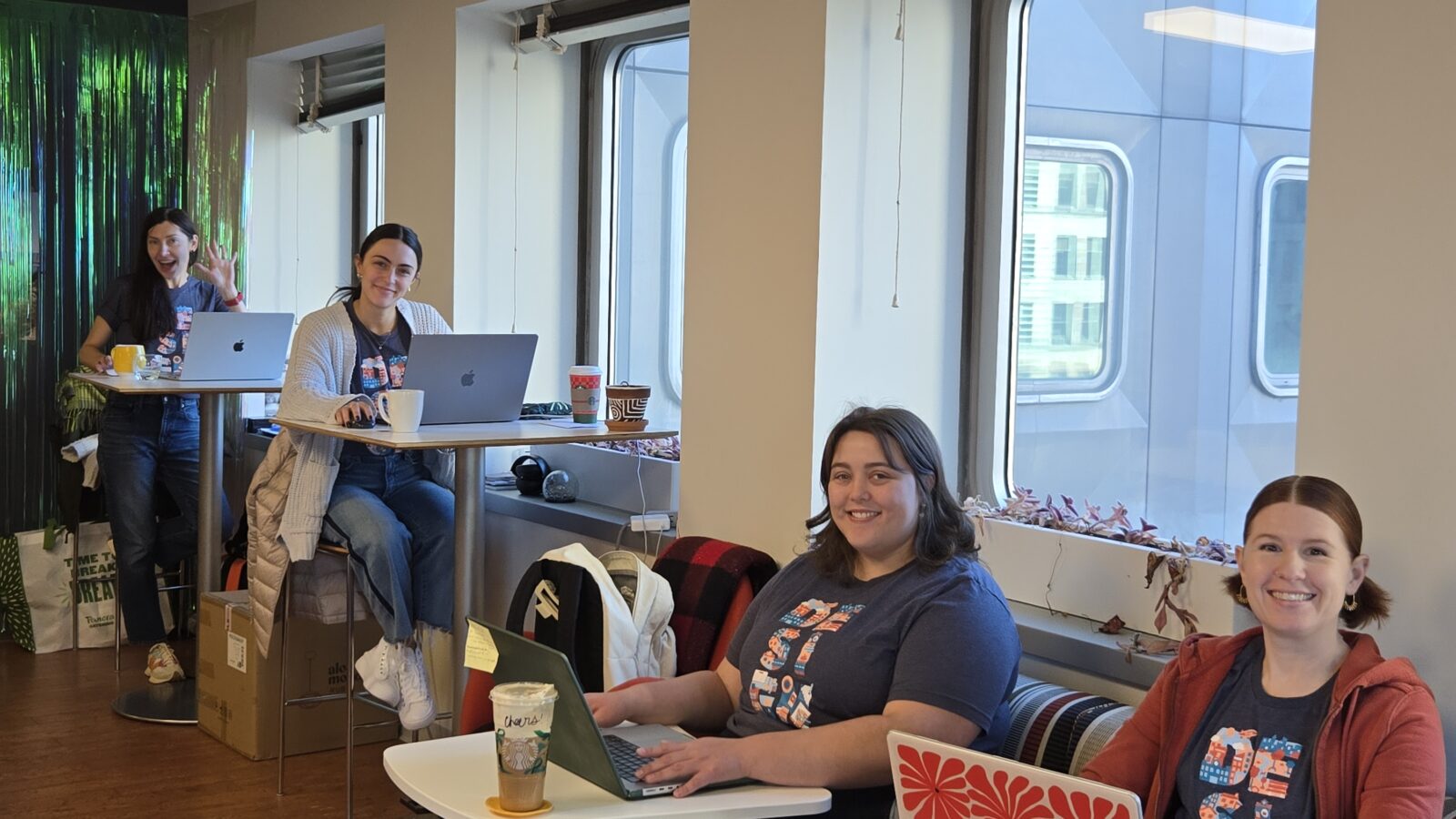
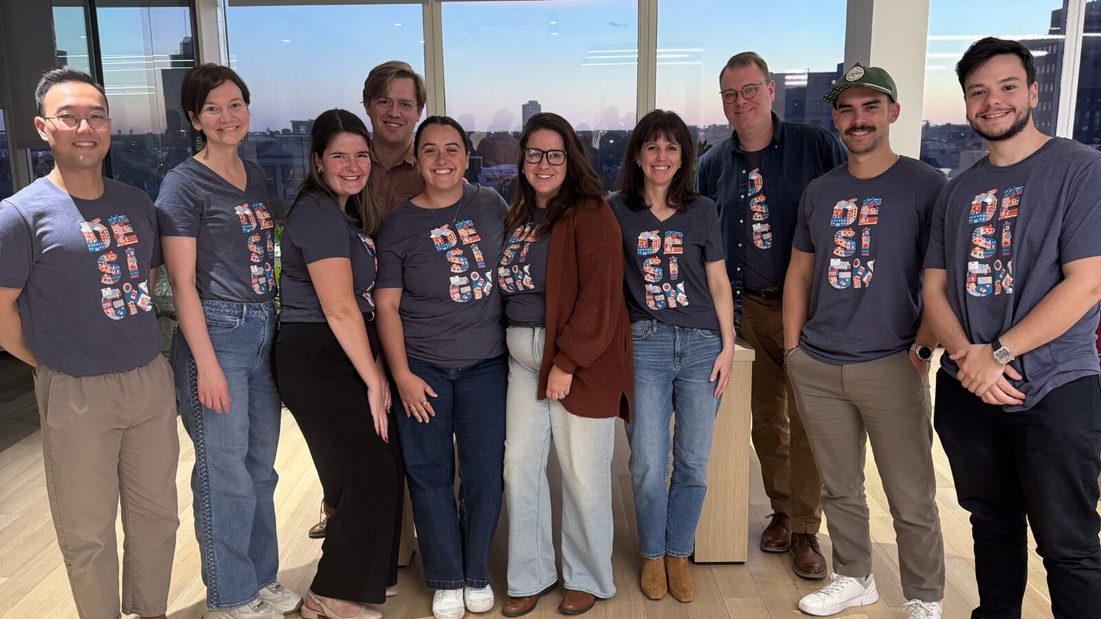
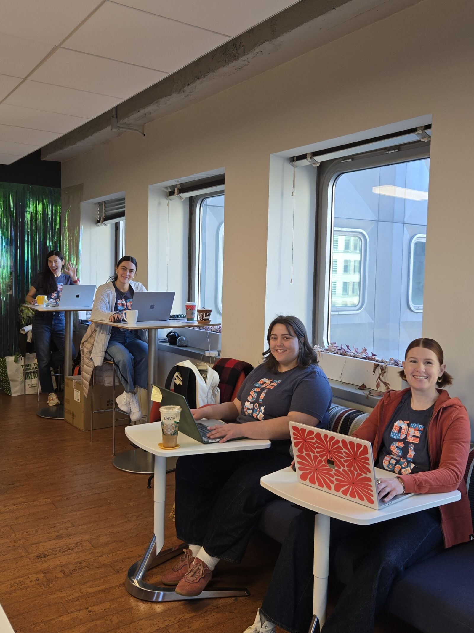
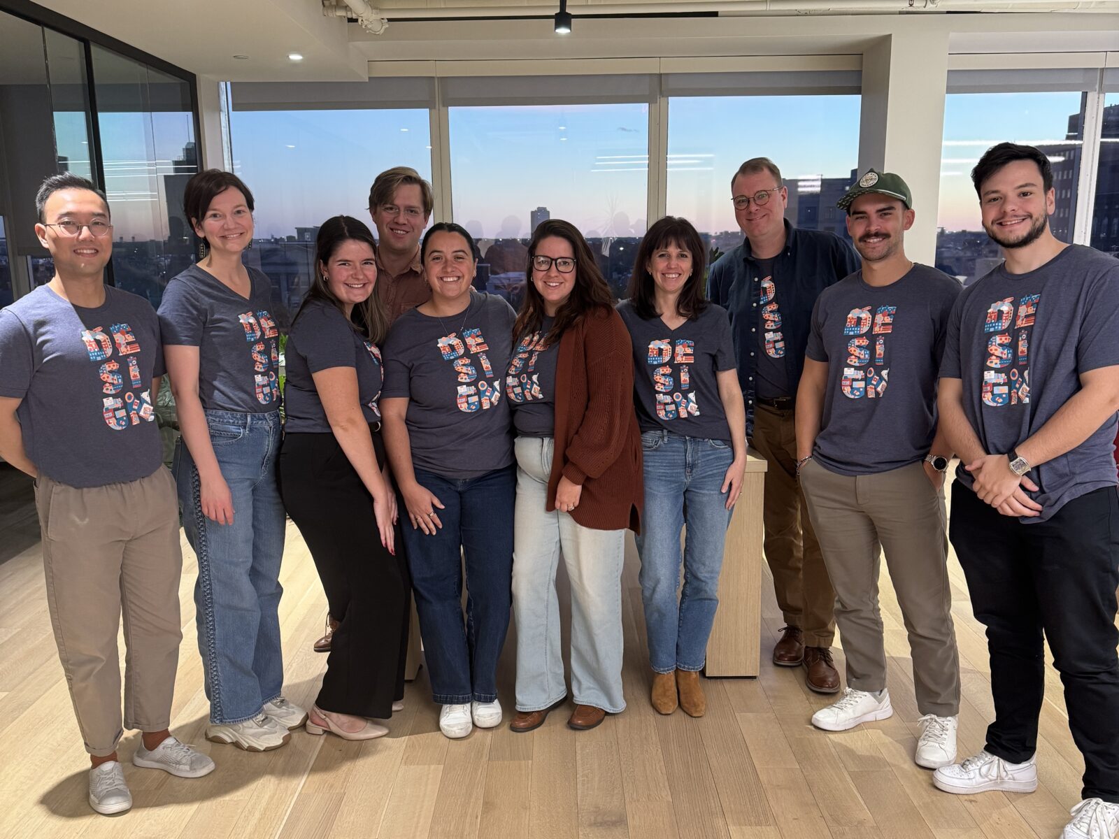
We explored 11 new palettes and selected 5 variations for the studio to vote on. The winner became our 2025 Strada t-shirt.
RS: The DESIGN has been further integrated into internal missives, exterior social posts and publications, and even a Strada mug that was paired with our internal Wellness Boxes!